The aesthetic appeal of matte flatware is undeniable, but its durability is a matter of material science, not just style.
- The highest quality matte finishes are created through a process called PVD coating, which results in a surface far harder than standard steel.
- Weight and balance, not just looks, are the true indicators of quality flatware that feels substantial and premium to your guests.
Recommendation: Prioritize flatware made from 18/10 stainless steel with a verified PVD coating, and always test a sample piece for weight and balance before committing to a full rental order.
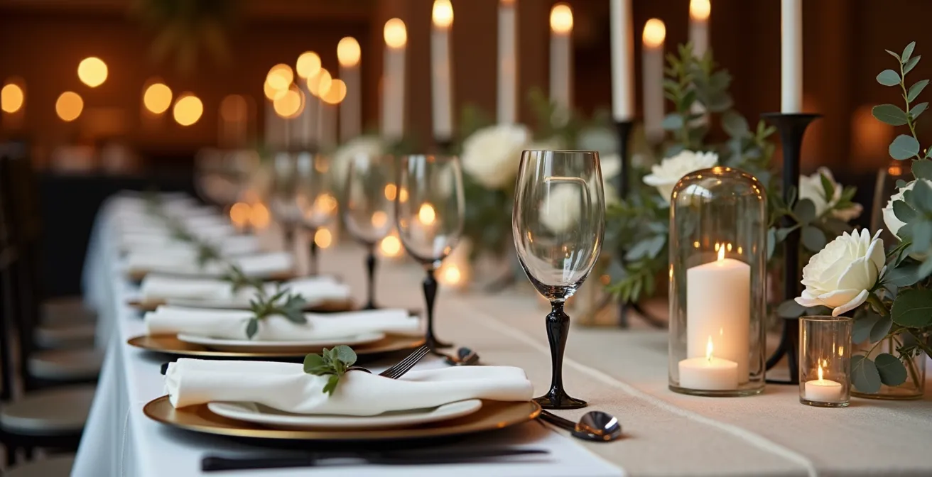
You’ve seen it scrolling through Pinterest and Instagram: the dramatic, sophisticated tablescape set with matte black or gold flatware. It’s modern, it’s bold, and it feels like the perfect statement for your wedding. But a nagging thought persists, fueled by whispers in forums and comments sections: Does it scratch? Will it look cheap? Will it be covered in fingerprints before the first course is even served? As a rental inventory manager, my job isn’t to sell you a dream; it’s to manage the assets that create it. I’ve seen hundreds of sets of flatware go out and come back, and I can tell you the truth isn’t a simple ‘yes’ or ‘no’.
Most advice simply tells you to “be careful” or “hand-wash only,” which is useless information for a one-day, high-volume event like a wedding. The real conversation isn’t about gentle handling; it’s about material science and manufacturing quality. The difference between a set that scratches by looking at it and one that withstands a full wedding service lies in an industrial process called PVD coating and the fundamental quality of the steel beneath it. This guide is your industrial briefing. We’re going beyond the aesthetics to give you the operational knowledge to choose trendy flatware that doesn’t just look good in photos, but performs under pressure.
This article breaks down the technical and practical realities of using matte flatware for your event. We will cover everything from the science of scratch resistance to the art of table styling, giving you the confidence to make a choice that is both beautiful and operationally sound.
Table of Contents: A Manager’s Guide to Matte Flatware Performance
- Why Matte Gold Shows Scratches More Than Polished Silver?
- How to Check if Trendy Flatware Is Too Light and Feels Cheap?
- How to Handle Matte Flatware to Avoid Oily Fingerprints in Photos?
- Which Food Colors Look Unappetizing Next to Gold Flatware?
- How to Match a Sharp Steak Knife With a Matte Flatware Set?
- How to Mix Acrylic and Metal for a Sleek Industrial-Modern Vibe?
- Brushed vs. Shiny Gold: Which Complements Your Flatware Best?
- How to Curate Bespoke Table Styling That Encourages Guest Interaction?
Why Matte Gold Shows Scratches More Than Polished Silver?
The core of this question lies in physics and material science, not just color. A traditional polished silver finish hides minor abrasions because its surface reflects light in thousands of different directions. A tiny scratch simply becomes another reflective angle, getting lost in the overall shine. A matte surface, by contrast, is designed to absorb light, creating a uniform, non-reflective plane. Any scratch on this surface breaks that uniformity, catching the light and standing out starkly against the non-reflective background. It’s not necessarily less durable, just less forgiving visually.
However, true durability comes from the coating itself. High-quality colored flatware uses a process called Physical Vapor Deposition (PVD). This isn’t a paint or a plating; it’s a process where a solid material is vaporized in a vacuum and deposited onto the stainless steel, molecule by molecule. The process results in a finish with an exceptional surface hardness of around 1800 HV (Vickers Pyramid Number), a metric for scratch resistance. For context, standard stainless steel is typically 200-240 HV. This is why a well-made PVD piece can be incredibly robust. The cheap knock-offs that give matte flatware a bad name are often just spray-painted or poorly plated, and will scratch and chip almost immediately.
Your Action Plan: How to Identify Quality PVD Coating
- Check Base Material: Insist on 18/10 stainless steel composition. This means it contains 18% chromium for rust resistance and 10% nickel for luster and hardness. This is the foundation of quality.
- Verify Coating Uniformity: Examine the piece under bright light, paying close attention to the edges of fork tines and spoon bowls. The color should be perfectly even, with no thinner spots, bubbles, or dark patches.
- Test the Weight: Quality pieces should feel substantial and balanced in your hand. A lightweight feel is an immediate red flag for a cheaper base metal and thin coating.
- Ask for Specifications: A reputable rental company or manufacturer should be able to provide specifications on the coating thickness or confirm it’s PVD.
- Avoid Visual Inconsistencies: If you see any visible imperfections, no matter how small, it’s a sign of poor quality control. Reject the piece.
How to Check if Trendy Flatware Is Too Light and Feels Cheap?
The “feel” of flatware is a critical, often-overlooked element of the guest experience. Weight is the most obvious indicator of quality. Cheap flatware uses less metal, often a lower-grade stainless steel like 18/0, which feels flimsy and can even bend under pressure. As professional event planners recommend, you should always handle a sample during the rental selection process. A quality piece should have a satisfying heft that communicates value and permanence, a tactile signal that you’ve invested in quality for your guests.
But weight alone isn’t the whole story. The true test of premium flatware is its ergonomic balance. This is about how the piece feels in motion, as a guest lifts it from the table to their mouth. A well-designed fork or knife will have its center of gravity located where it naturally rests on the index finger, making it feel like a natural extension of the hand. A poorly balanced piece feels clumsy and top-heavy, requiring more effort to use. This detail, while subtle, contributes to the overall sense of comfort and luxury throughout a multi-course meal.
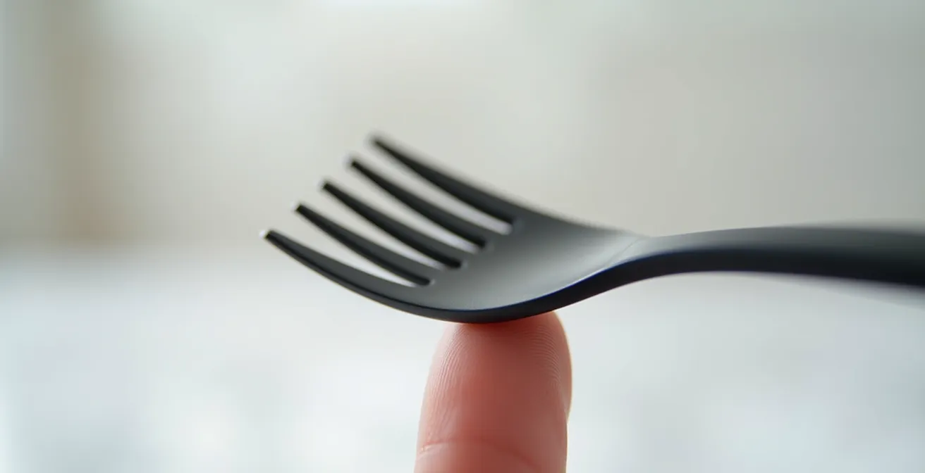
You can perform this test yourself. As shown in the image, balance the fork or spoon on your finger. A quality piece will sit level with minimal effort. If the head or handle immediately dips, it’s a sign of poor design and weight distribution. This simple, practical test is your best tool to differentiate between flatware that just follows a trend and flatware that embodies genuine craftsmanship, ensuring your guests’ tactile experience matches the visual one.
How to Handle Matte Flatware to Avoid Oily Fingerprints in Photos?
Matte finishes are highly susceptible to oils and moisture from fingerprints, which can ruin the clean, uniform look essential for wedding photography. The micro-texture that absorbs light also readily traps oils, creating visible smudges. Unlike shiny cutlery where a smudge might blend in, on a matte surface, it stands out as a dark, glossy patch. This is an operational challenge that requires a strict protocol, especially in the crucial hours before guests arrive when photographers are capturing detail shots.
From an inventory management perspective, we train staff to minimize contact and have a clear system for final placement. It’s not about being delicate; it’s about being methodical. A professional setup team will have a clear operational handling protocol in place. According to insights from event setup professionals, the best practice is to treat the flatware like a delicate art installation until the moment of use. They advise a multi-step approach that ensures the pieces remain pristine for photography and for the guests’ arrival.
To achieve a picture-perfect table, a strict handling protocol is non-negotiable. As a standard for high-end events, event experts follow a clear procedure for final placement. The essential steps include:
- Handle with Care: Staff should be trained to handle all flatware only by the lower third of the handles, never touching the bowls of spoons or the tines of forks.
- Use Gloves for Final Placement: During the final setting of the table, especially just before photography, staff should wear clean cotton gloves to prevent any oil transfer.
- Keep Cloths on Standby: Each service station should be equipped with clean, dry microfiber cloths for any necessary last-minute touch-ups right before the reception space is revealed.
- Brief the Photo Team: Inform photographers that direct flash can accentuate smudges. Suggest they use diffused lighting or natural light for detail shots of the place settings.
- Timing is Everything: The final placement of flatware should be one of the very last steps in setting the room, done just before guests are invited in to minimize the chance of accidental handling.
Which Food Colors Look Unappetizing Next to Gold Flatware?
The interaction between the color of your flatware and the food on the plate is a crucial element of food presentation. While gold flatware, particularly matte gold, brings warmth and luxury, it can clash with or wash out certain food colors, making them appear less appealing. The goal is contrast and harmony. Gold’s yellow undertones can create unappetizing combinations with foods that share a similar color family but a different tone, such as certain yellow-tinted curries or mustard-based sauces, which can look muddy next to the metallic finish.
Conversely, gold flatware excels when placed against deep, rich, or neutral colors. Foods with earthy tones like roasted mushrooms, seared steaks, or vibrant green vegetables create a beautiful contrast. Similarly, desserts featuring dark chocolate or deep red berries are stunningly framed by gold. The key is to think like a food stylist: the plate is the canvas, the food is the art, and the flatware is the frame. A successful pairing makes the food look more vibrant and delicious.
The texture of the flatware also plays a role. Oily or greasy foods are particularly problematic with matte finishes, as the oil can cling to the surface and create smudges that detract from both the food and the cutlery. The following table, based on common food styling principles, offers a guide for pairing food with gold flatware for the best visual impact.
| Food Type | Visual Compatibility | Recommended Plate Color |
|---|---|---|
| Earthy tones (mushroom, butternut) | Excellent | White or charcoal |
| Creamy sauces | Good | Dark plates preferred |
| Oily/greasy foods | Poor | Avoid with matte finishes |
| Caramel/chocolate desserts | Excellent | Any neutral tone |
How to Match a Sharp Steak Knife With a Matte Flatware Set?
This is one of the biggest practical hurdles of choosing trendy flatware. Your standard five-piece matte black or gold set almost never includes a high-performance steak knife. The knives included in these sets are dinner knives, designed for softer foods; they lack the weight, balance, and sharp, often serrated, edge required for a quality cut of meat. Forcing guests to saw through a beautiful filet mignon with a standard dinner knife is a major service faux pas. This creates a functional and aesthetic dilemma: how do you provide a proper tool without disrupting your carefully curated tablescape?
p>
From an operational standpoint, this is a known issue in the rental industry. High-end wedding rental companies have a standard workaround. As one Charleston-based rental company notes, they often source specialty steak knives separately from professional restaurant supply vendors when clients request matte flatware. This is because manufacturers of trendy flatware focus on aesthetics, while restaurant suppliers focus on performance. The solution is not to find a perfect match, but a complementary one.
The priority must be blade quality. A coated blade, even with PVD, is a bad idea for a steak knife as the cutting action will inevitably wear down the finish. Therefore, you should always opt for a polished stainless steel blade. The matching effort should focus on the handle, not the blade. Look for a steak knife with a handle that complements your matte set in either material or color. A simple black polymer handle can coordinate seamlessly with a matte black set, while a knife with a warm wood handle can beautifully complement a matte gold set. The goal is a cohesive look, not a perfect match. Here are the key criteria:
- Prioritize the Blade: Always choose a high-quality, uncoated, polished stainless steel blade for performance and durability.
- Match the Handle: Focus on matching the handle’s material or color to your main set. A sleek black handle or a complementary wood grain are excellent options.
- Introduce Textural Contrast: Don’t be afraid to use a knife with a wood or bone handle. This can add a sophisticated layer of texture to your place setting.
- Source from Professionals: Look to restaurant supply stores, not retail brands, for high-performance steak knives that are built to last.
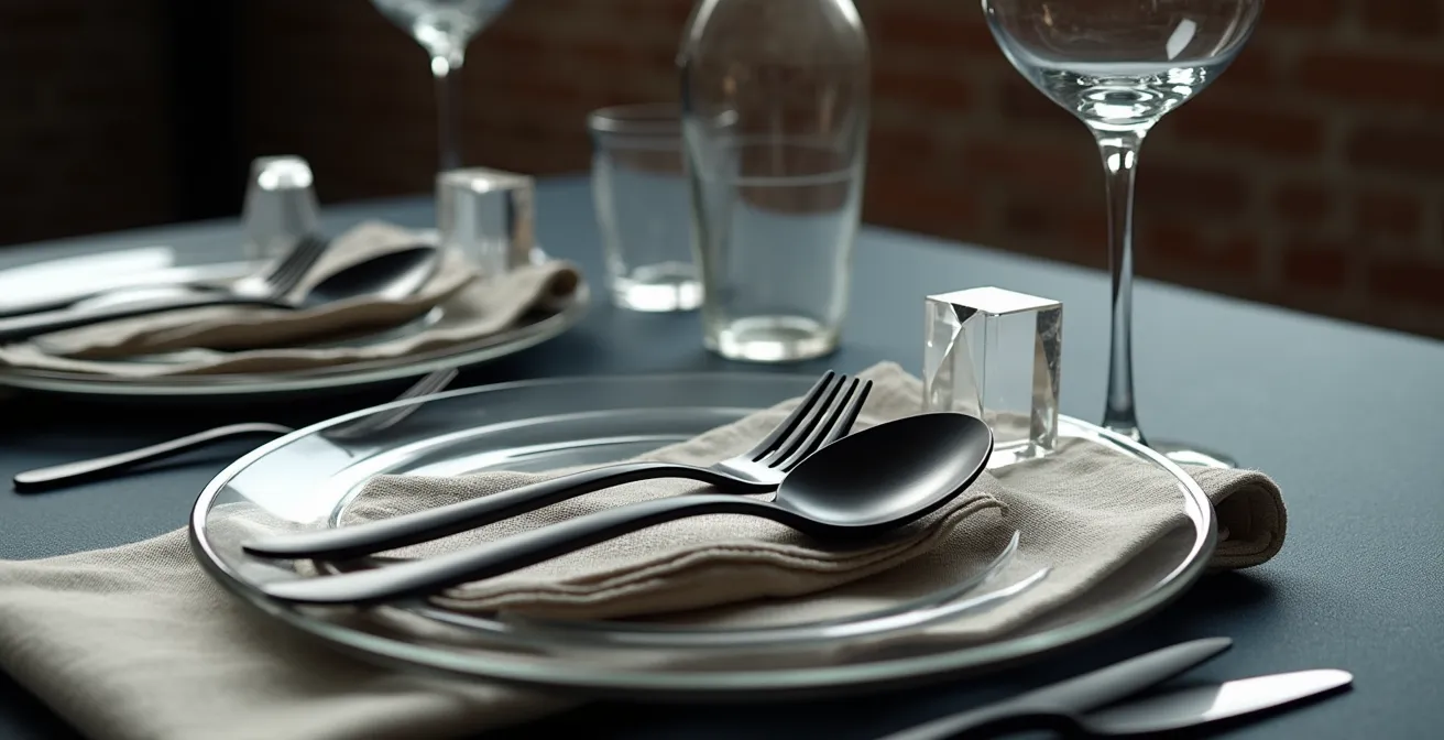
How to Mix Acrylic and Metal for a Sleek Industrial-Modern Vibe?
The industrial-modern aesthetic is built on a dialogue between raw and refined materials. It’s the contrast between exposed brick and polished concrete, or in the case of a tablescape, the interplay between solid, opaque metal and clear, ethereal acrylic. Mixing these two materials is a powerful way to create a look that feels both edgy and sophisticated. The key is to let each material do what it does best: metal provides weight and structure, while acrylic provides lightness and a sense of space.
Start by using acrylic for larger elements to avoid visually overwhelming the table. Clear acrylic “ghost” chairs are a classic choice, as they provide seating without adding visual bulk, allowing the table itself to be the hero. Acrylic charger plates work on the same principle; they define the place setting with a clean, modern edge while allowing the color and texture of the linen below to show through. This transparency is the perfect canvas for the strong, graphic statement of matte black flatware.
Once you have this base of transparent and opaque elements, you can introduce other textures to add warmth and prevent the look from feeling too sterile. As event designer Sarah Strausser notes in The Knot, “Mixing in a matte stoneware option may have felt ‘casual’ in the past, but not anymore.” A matte black or charcoal stoneware plate layered on top of a clear acrylic charger plate adds depth and a tactile quality. Finish the look with raw linen napkins to provide an organic, soft contrast to the hard, clean lines of the metal and acrylic.
Brushed vs. Shiny Gold: Which Complements Your Flatware Best?
When incorporating other metallic elements into your tablescape, such as charger plates, candle holders, or vase accents, the finish of the gold is as important as the color itself. The choice between a brushed or shiny (polished) gold finish will dramatically impact the mood and photographic quality of your table. It’s a decision between serene sophistication and high-energy glamour. A brushed gold finish has a soft, satin-like texture that absorbs light rather than reflecting it. This creates a calmer, more understated and intimate atmosphere. For photography, it’s incredibly forgiving, producing no harsh “hot spots” or glare, which allows the texture and form of the object to be the focus.
On the other hand, shiny gold is all about energy and movement. It reflects light, creating a dynamic play of highlights that can make a space feel more festive and celebratory. It pairs well with dramatic lighting and high-energy events. However, it is far less forgiving. Every smudge and fingerprint will show, and it requires careful lighting from photographers to avoid blown-out highlights and distracting reflections. From a durability standpoint, high-quality PVD is still the superior choice for any colored finish. In fact, industry testing shows that PVD coatings are up to 4 times harder than traditional chrome plating, making a well-made brushed PVD piece just as tough as a shiny one.
The choice ultimately depends on the overall vision for your event. An intimate, romantic dinner might call for the soft glow of brushed gold, while a glamorous, high-energy party might be better served by the sparkle of shiny gold. This table breaks down the key characteristics to help you decide.
| Aspect | Brushed Gold | Shiny Gold |
|---|---|---|
| Light Reflection | Absorbs light, creates calm | Reflects light, creates movement |
| Photography | Forgiving, no hot spots | Requires careful lighting |
| Best For | Intimate dinners | High-energy celebrations |
| Maintenance | Hides fingerprints better | Shows every smudge |
Key Takeaways
- The durability of matte flatware is determined by its manufacturing process (PVD coating) and base material (18/10 steel), not its color.
- Guest experience is defined by tactile details; quality flatware must have both substantial weight and proper ergonomic balance.
- Aesthetic choices have practical consequences; matte finishes require strict handling protocols, and steak knives often need to be sourced separately.
How to Curate Bespoke Table Styling That Encourages Guest Interaction?
A truly successful tablescape does more than just look beautiful in photos; it functions as a catalyst for conversation and connection. Once you’ve made the foundational choices about durable and practical elements like your flatware, you can focus on the final layer: curation that encourages your guests to interact with each other. The goal is to transform the table from a static display into a dynamic environment. This is achieved by embedding elements of surprise, personality, and shared experience directly into the place setting.
This goes beyond just a pretty centerpiece. As documented by wedding photographer Susan Stripling, introducing interactive elements can have a measurable impact. Her observations show that tables with small games or personalized conversation starters lead to significantly more cross-table interactions and guest mingling compared to tables with traditional, static floral arrangements. By giving guests something to do, discover, or talk about, you are actively engineering a more engaging and memorable experience for them. The flatware itself can even be a talking point if it has a satisfying weight and quality that guests notice and appreciate.
Integrating these strategies requires a shift in thinking, from simply decorating a table to designing an experience. The focus moves from purely visual elements to tactile and conversational ones. Consider these strategies to turn each table into a hub of social energy:
- Conversation Starters: Place beautifully designed cards at each setting with fun facts about the guests at that table, or prompts like “Ask the person to your right about their best travel adventure.”
- Shareable Stations: Instead of individual bread plates, create a central station on the table with an artisanal loaf, high-quality olive oil, and sea salt that guests must pass and share.
- Tactile Appreciation: As mentioned, using heavier, well-balanced flatware can spark comments and appreciation, serving as a subtle, quality-focused conversation starter.
- Interactive Place Cards: Design place cards that have a question on the back for the person sitting opposite them, immediately breaking the ice.
- Shared Elements: Arrange small bud vases or tasting dishes in a way that requires guests to pass them to one another, creating natural, low-pressure moments of interaction.
By investing thought into the material science and operational reality of your choices, you’re not just picking pretty things. You are building a reliable foundation for a flawless event, freeing you and your team to focus on what truly matters: creating an atmosphere where your guests can connect and celebrate.