The 40% premium for letterpress is not a cost; it’s an investment in a verifiable sensory experience that digital printing cannot replicate.
- Value is tactile: A deep, luxurious impression is only achievable on heavy paper, making 600gsm cotton stock a non-negotiable benchmark.
- Strategic design: Single-color printing and blind debossing are sophisticated tools to manage cost without sacrificing luxury, not compromises.
Recommendation: Assess your budget against the “sensory ROI”—the tangible feel and visual weight that only artisanal printing provides. Request physical samples to feel the difference firsthand.
The moment a guest receives your wedding invitation, the first impression is made. Will it be glanced at and set aside, or will it be truly felt? This single question is at the heart of the debate between digital printing and the artisanal craft of letterpress. Many couples see the significant price difference—often 40% or more—and understandably question the expense. They hear that letterpress is “nicer” or “more traditional,” but these vague terms fail to justify a tangible budget line item.
This decision is often weighed against other luxury details, where visible impact is easier to measure. For instance, is the premium for lush David Austin roses over standard varieties a better use of funds? Does hiring a full-service planner truly save more in the long run than a “month-of” coordinator? These are questions of value, not just cost. But what if we approached your stationery with the same discerning eye, not as an expense, but as an appraisal of its intrinsic worth?
The key isn’t simply acknowledging that letterpress is more expensive, but understanding precisely why. The answer lies in the tangible return on sensory investment that each cost driver provides. This guide moves beyond the surface-level discussion to deconstruct the core value factors. We will examine the mechanics of paper and impression, the strategy behind cost-effective design, the hidden liabilities of weight, and the artistry behind a longer production timeline. By understanding these elements, you can make an appraiser’s choice, ensuring every dollar spent translates into an unforgettable first impression.
In this detailed appraisal, we will dissect the components that contribute to the cost and value of luxury wedding choices. By understanding the “why” behind the price, you can make informed decisions that align with both your budget and your vision for an elegant, memorable event.
Contents: Appraising the True Value of Luxury Wedding Details
- Why 600gsm Cotton Paper Is Essential for Deep Letterpress Impressions?
- How to Design a Stunning Invite Using Only One Ink Color to Save Money?
- How to Use Blind Deboss for Minimalist Texture Without Ink Costs?
- The Hidden Postage Cost of Thick Letterpress Suites
- Why Letterpress Production Takes 4 Weeks Longer Than Digital?
- David Austin vs. Standard Roses: Is the Price Difference Visible?
- Why “Month-Of” Coordination Often Costs More in Stress and Money?
- How to Use Gold Foil Stamping Without Affecting Invitation Readability?
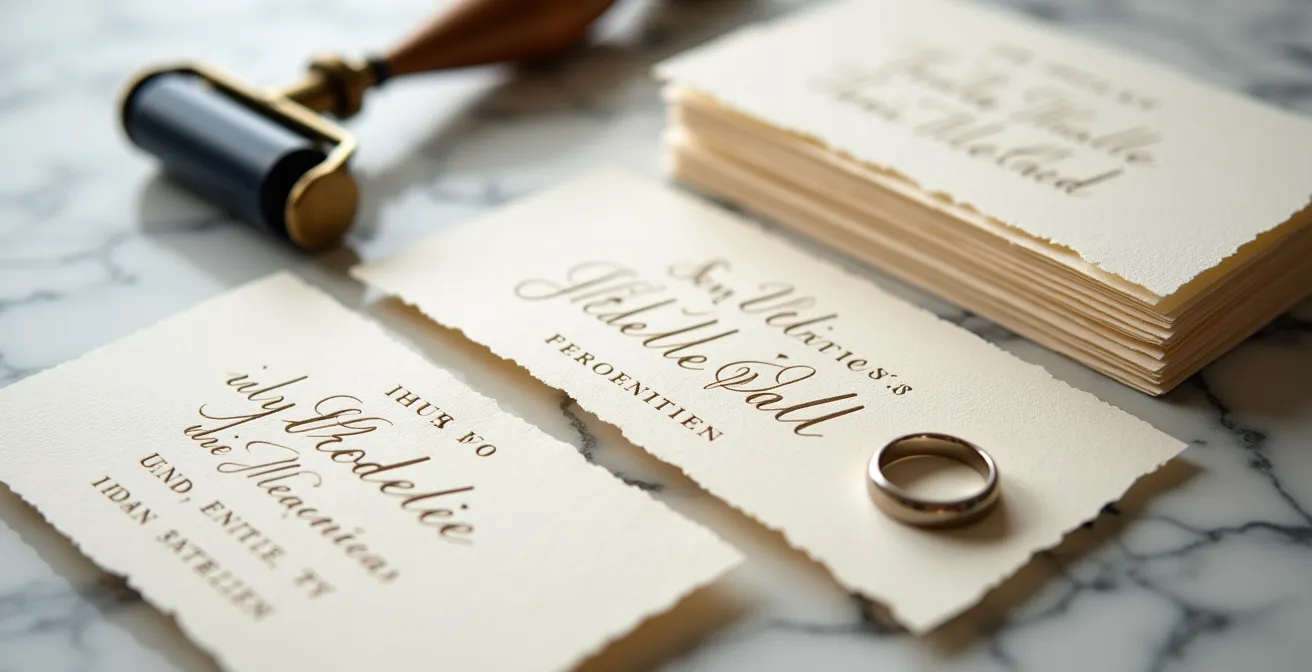
Why 600gsm Cotton Paper Is Essential for Deep Letterpress Impressions?
The single most important factor in the perceived value of letterpress is the tactile depth of its impression—the “bite” of the design into the paper. This effect is not just a visual detail; it’s a physical experience that communicates luxury and craftsmanship. However, this deep impression is physically impossible to achieve on standard paper. It requires a specific foundation: thick, soft, 100% cotton paper. Digital printing lays ink on the surface, but letterpress uses pressure to push the design into the paper’s fibers. If the paper is too thin or rigid, it cannot properly receive the impression.
This is where paper weight, measured in grams per square meter (gsm), becomes a critical part of the appraisal. While standard cardstock might be 270gsm, high-quality letterpress invitations are most commonly printed on thick cotton cardstock ranging from 300gsm to 600gsm. The 600gsm paper, also known as 2-ply or double-thick, is the industry benchmark for a truly luxurious and noticeable impression. Its substantial thickness and soft cotton composition allow the printing plate to press deeply, creating dramatic shadows and a tangible texture that guests can feel instantly.
To truly appreciate the tactile quality this thickness provides, consider the physical structure of the paper itself. The image below showcases the deep valleys and soft shoulders created by the press on a substantial cotton sheet. This is the sensory ROI your investment delivers.
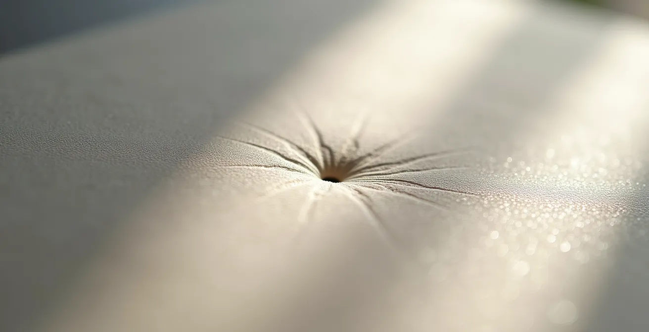
Choosing a lighter weight paper to save money directly compromises the primary benefit of letterpress. It’s akin to buying a sports car but opting for a small engine. The visual and tactile impact is diminished, reducing the overall value. The following table breaks down how paper weight directly correlates with impression quality, making it clear why 600gsm is the superior choice for a main invitation card that aims to impress.
The following comparison, based on data from printing experts, clarifies the direct link between paper weight and the final aesthetic. This information is crucial for any couple appraising where to allocate their stationery budget for maximum impact.
| Paper Weight | GSM Equivalent | Thickness | Best Use Case | Impression Depth |
|---|---|---|---|---|
| 110lb (1-ply) | 300gsm | Standard | Enclosure cards, RSVP | Moderate |
| 220lb (2-ply) | 600gsm | Double thick | Main invitation | Deep & luxurious |
| 330lb (3-ply) | 900gsm | Triple thick | Ultra-premium suites | Maximum impact |
How to Design a Stunning Invite Using Only One Ink Color to Save Money?
A primary cost driver in letterpress is the number of “passes” through the press. Each ink color requires its own custom plate and a separate run for every single card in the suite. This labor-intensive process means that moving from a one-color to a two-color design can nearly double the printing cost. While standard letterpress invitations typically cost between $3 and $6 per card for a single color, adding more can quickly escalate the budget. However, a limited color palette should not be viewed as a compromise. Instead, it is an opportunity for sophisticated, high-impact design.
The key is to leverage other design elements to create visual interest and hierarchy, a technique known as using design as a cost lever. Instead of relying on color to differentiate information, a skilled designer uses typography, spacing, and layout. A single, well-chosen ink color—like a deep charcoal on a soft white cotton paper—can feel more timeless and elegant than a multi-color design. The beauty of letterpress is that the physical impression of the text already adds a layer of texture and shadow that digital printing lacks.
By focusing on one color, you free up the budget to invest in the most impactful element: the paper itself. A one-color design on luxurious 600gsm paper will always have a higher perceived value than a two-color design on flimsy 300gsm stock. It’s a strategic choice to prioritize the tactile experience over a purely chromatic one. The following plan outlines how to maximize the elegance of a single-color design.
Action Plan: Maximizing Impact with a Single-Color Design
- Choose a high-contrast ink color against your paper (e.g., deep charcoal on white, or white ink on a dark paper for a dramatic effect).
- Create visual hierarchy by using varying font weights and sizes, such as a bold, larger font for names and a lighter, smaller font for details.
- Incorporate blind debossing (impression without ink) for monograms or patterns, adding texture without the cost of a second color pass.
- Treat typography as a design element by artfully combining a classic serif font for headers with a clean sans-serif for body text.
- Consider a specialty ink, like a subtle metallic, which provides more visual interest than a standard color but still only requires a single press run.
How to Use Blind Deboss for Minimalist Texture Without Ink Costs?
Blind debossing is a sophisticated technique where a design is pressed into the paper without any ink. It creates a subtle, elegant texture that catches the light, adding a layer of minimalist luxury. From a design perspective, it’s the perfect tool to add interest—a monogram, a border, or a subtle pattern—without introducing another color. However, from a cost appraisal perspective, it comes with a critical caveat that many couples overlook. As the experts at Reb Peters Press note, this technique is not “free.”
For the sake of pricing, blind deboss (pressed without ink) is considered its own ink color.
– Reb Peters Press, Invitation Pricing Calculator
This is because, like an inked color, blind debossing requires its own custom plate and its own pass through the press. Therefore, combining a single ink color with a blind debossed element is priced as a two-color job. The value proposition, then, is not in direct cost savings compared to a one-color design. Rather, its value lies in achieving a two-layer textural effect for the price of two ink colors, but with a more refined and modern aesthetic. It is a powerful tool when used as part of a single-color design strategy, as seen in the minimalist aesthetic of the invitation detail below.
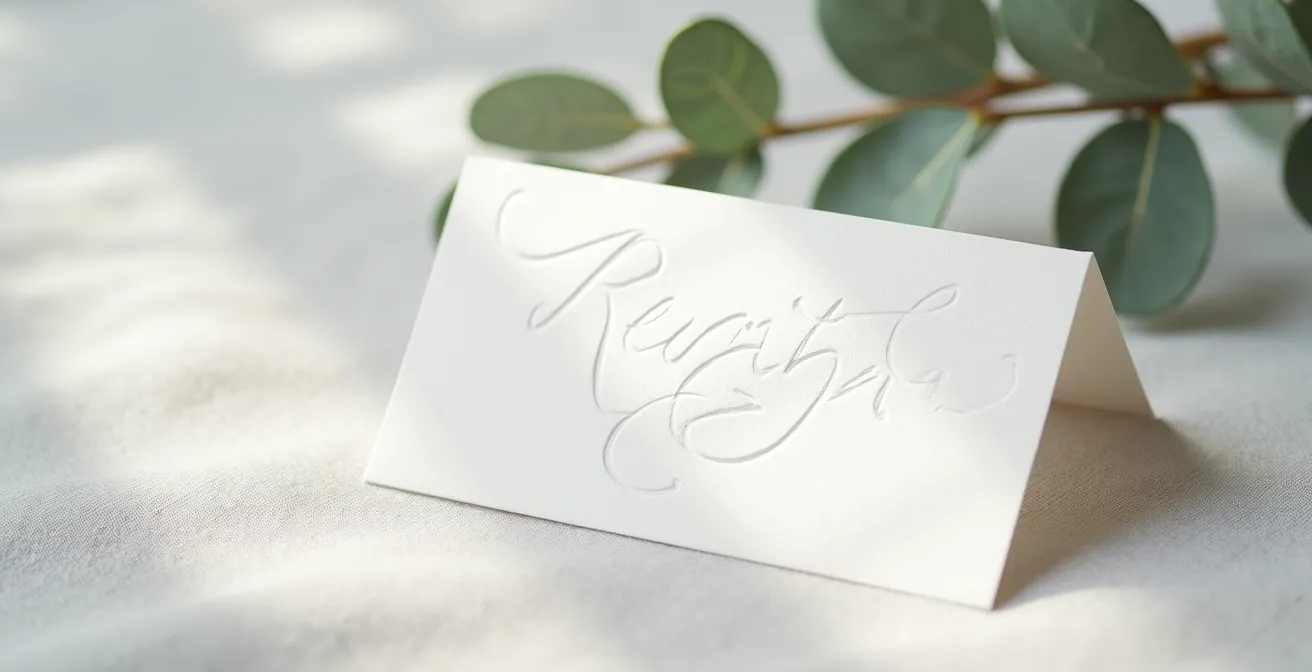
The true power of blind debossing is unlocked on heavy paper. On a 600gsm cotton stock, the press can create a deep and highly defined impression that is both visually and tactilely engaging. On thinner paper, the effect is significantly diminished and may not be worth the cost of the additional press run. When appraising its worth, consider blind debossing a strategic upgrade that adds significant sensory ROI, creating a piece that invites touch and closer inspection. It transforms a simple card into a sculpted object.
The Hidden Postage Cost of Thick Letterpress Suites
In the appraisal of any luxury item, one must account for not just the purchase price but also the “cost of ownership.” For letterpress wedding invitations, this hidden cost often appears at the post office. The very element that gives letterpress its value—the substantial, heavy paper stock—is also a potential liability when it comes to mailing. A full invitation suite printed on 600gsm cotton paper, complete with an RSVP card, details card, and a quality envelope, will almost certainly weigh more than a standard letter.
In the United States, for example, standard first-class postage covers letters up to one ounce. As postage regulations confirm, letterpress suites on 600gsm paper typically exceed the weight limit and require additional postage. This might seem like a minor detail, but when multiplied by 100 or 150 invitations, this “non-machinable surcharge” can add a significant and unexpected amount to your final stationery budget. An extra $0.40 per invitation, for example, adds $60 to a 150-piece mailing.
Furthermore, thickness can also trigger extra fees. Envelopes thicker than 1/4 inch may require hand-canceling, a process where each stamp is marked by hand at the post office to prevent the thick envelope from getting jammed or damaged in automated sorting machines. While this protects your beautiful invitations, it often comes with an additional fee and requires a special request at the postal counter. The prudent approach is to assemble one complete invitation suite and take it to the post office to be weighed and measured. Do this before you purchase your stamps to ensure you have the correct postage and avoid the embarrassing scenario of your invitations arriving with “postage due.”
Why Letterpress Production Takes 4 Weeks Longer Than Digital?
In a world of instant gratification, the production timeline for letterpress can be a shock. While digital invitations can often be printed and shipped within a week or two, a realistic timeline for letterpress is significantly longer. As a general rule, you should budget for an average of 4 weeks for letterpress vs 1-2 weeks for digital printing, and that’s *after* your design is finalized. This extended timeframe is not a sign of inefficiency; it is a direct reflection of the artisanal, hands-on nature of the craft. Understanding this process is key to appreciating why the time is a component of the value, not a drawback.
Unlike digital printing, which is largely automated, every step of the letterpress process involves a skilled craftsperson. The journey from a digital file to a finished invitation is a meticulous one, as documented by boutique studios. This “artisanal timeline” creates the unique quality that cannot be rushed or replicated by a machine.
Case Study: The Artisanal Timeline of Letterpress Production
The studio Lily & Roe Co. provides insight into their hands-on process. First, custom polymer plates must be precision-made from the final digital design (3-5 business days). Next, the printer manually mixes ink by hand to perfectly match the desired color for each specific project (1 day). The printing itself is a deliberate process: each sheet of paper is fed individually into a vintage press, one at a time. If the design has a second color or a blind deboss, the entire stack must dry completely before being fed through the press a second time for the next pass (5-7 days). Finally, every single piece undergoes rigorous quality control to ensure the impression is crisp and the registration is perfect before being packed for shipping. This manual, time-intensive approach is what creates the subtle variations and unparalleled quality that define each invitation as a small work of art.
When planning for letterpress, you must shift your mindset from one of mass production to one of commissioned art. The 4-6 week timeline is a testament to the care and skill invested in your suite. It is essential to finalize your design and place your order well in advance—ideally 4-5 months before your wedding date—to allow for this unhurried process and avoid any last-minute stress.
David Austin vs. Standard Roses: Is the Price Difference Visible?
The same value-appraisal principles we apply to stationery can be extended to other significant wedding details, such as floral arrangements. A common debate among couples is whether the premium price for specialty flowers like David Austin roses is justified over more common, standard hybrid tea roses. From a distance, a rose is a rose. But in the context of a wedding—where details are viewed up close and immortalized in photography—the difference is not just visible, it’s dramatic.
The value of a David Austin rose lies in its unique structure and sensory properties. Unlike the uniform, tight bud of a standard rose, these English garden roses are known for their high petal count, complex ruffled appearance, and powerful fragrance. This isn’t just a matter of botanical preference; it translates directly into visual impact. The intricate layers of petals create incredible depth and texture, which is why they photograph exceptionally well, adding a look of luxurious softness to bouquets and centerpieces that standard roses cannot match.
The cost difference is significant, but the return on visual investment is clear, especially for the elements that will be most photographed, such as the bridal bouquet. The following table provides a direct comparison, breaking down exactly what the additional investment delivers in terms of tangible, visible, and sensory features.
| Feature | David Austin Roses | Standard Roses | Visual Impact |
|---|---|---|---|
| Petal Count | 40-100+ petals | 20-40 petals | Fuller, more luxurious appearance |
| Bloom Size | 3-5 inches | 2-3 inches | More prominent in arrangements |
| Fragrance | Strong, complex scent | Minimal to none | Adds sensory dimension |
| Photography Appeal | Exceptional depth & texture | Standard appearance | Superior in close-ups |
| Vase Life | 5-7 days | 7-10 days | Shorter but more impactful |
Why “Month-Of” Coordination Often Costs More in Stress and Money?
Just as with tangible goods, the value of a service can be appraised by its ability to prevent problems versus simply reacting to them. This is perfectly illustrated in the choice between a full-service wedding planner and a “month-of” coordinator. On paper, the month-of package seems like a savvy way to save money, bringing in a professional only for the final stretch. However, this approach often incurs hidden costs—both financial and emotional—that a full appraisal must consider.
A month-of coordinator is not a planner; they are a crisis manager. They are hired to execute a plan that they had no part in creating. This means they spend their time inheriting contracts they didn’t negotiate, working with vendors they have no relationship with, and trying to patch holes in a timeline created by a non-professional. If a critical detail was overlooked—like forgetting to book transportation or miscalculating the number of rentals needed—the coordinator must now solve it on a tight deadline. This often leads to rush fees, limited availability, and paying a premium for last-minute solutions.
Imagine this scenario: you’ve booked a caterer, but the contract is vague on who provides service staff. A full planner would have clarified this nine months prior. A month-of coordinator discovers this three weeks before the wedding, forcing you to hire a staffing agency at an inflated emergency rate. The “savings” from not hiring a full planner are instantly erased. More importantly, the emotional cost is immense. The final weeks before your wedding should be filled with joyful anticipation, not frantic problem-solving. A month-of coordinator can alleviate the logistical burden on the day itself, but they cannot undo months of potential planning errors. The stress of those final weeks is a significant, non-financial cost to factor into your decision.
Key Takeaways
- The value of letterpress is in its tactile impression, which is directly proportional to paper weight; 600gsm is the benchmark for luxury.
- Strategic design choices like single-color printing and blind debossing are not compromises but sophisticated methods to achieve high impact at a controlled cost.
- Factor in “hidden” costs such as additional postage for heavy suites and the extended artisanal production timeline into your overall budget and schedule.
How to Use Gold Foil Stamping Without Affecting Invitation Readability?
Gold foil stamping is another artisanal printing method that, like letterpress, adds a layer of luxury and visual weight to wedding stationery. It involves using heat and pressure to apply a thin layer of metallic foil to paper. While the shimmering effect is undeniably beautiful, its application requires careful consideration to ensure it enhances, rather than hinders, the primary function of an invitation: to be read. When appraising the use of foil, the goal is to strike a perfect balance between opulence and legibility.
The most common mistake is using foil for large blocks of important text. Small, delicate, or serif-based fonts can be difficult to read when rendered in reflective foil, as the light can catch the surface and create glare, causing the letterforms to blur. The most effective strategy is to use foil as an accent element, not as the primary medium for information. Use it for a monogram, the border, key graphic elements, or perhaps just your names at the top of the invitation. The essential details—date, time, location—should be printed in a highly legible format, such as letterpress with a dark ink.
To further ensure readability when using foil, consider these design principles. First, choose a high-contrast paper; gold foil is most striking and readable on deep, rich colors like navy, black, or emerald, or on a clean, bright white. Second, if you must use foil for text, select a simple, bold, sans-serif font and ensure the point size is large enough to remain clear. Finally, always review a physical proof. The way foil catches the light in person can be very different from how it appears on a digital screen. This final check ensures your investment in foil adds the intended touch of glamour without sacrificing clarity for your guests.
Frequently Asked Questions about Letterpress Wedding Stationery
How much extra does postage cost for heavy letterpress invitations?
Thick letterpress suites typically require $0.20-0.40 additional postage per envelope, depending on final weight and thickness. Suites over 1 ounce or 1/4 inch thick may require hand-canceling, which can also incur extra fees at some post offices.
Can I use standard stamps on 600gsm letterpress invitations?
No, 600gsm cotton paper suites almost always exceed standard mail requirements for both weight and thickness. You will need to purchase additional postage. Always take a fully assembled invitation to your local post office to have it weighed and measured before buying stamps.
How can I reduce postage costs while keeping letterpress quality?
Consider a mixed-weight approach. Use the luxurious 600gsm paper for the main invitation card where it has the most impact, but opt for a lighter 300gsm stock for enclosure cards like the RSVP and details card. Using a postcard-style RSVP also reduces weight and requires less postage for the return trip.