The secret to a warm modern wedding isn’t sterile minimalism, but mastering intentional contrast to create an atmosphere that is both curated and deeply personal.
- Balance clean, architectural structures with soft, organic textures to add warmth and depth.
- Make trends timeless by grounding them in your personal story, turning a fleeting style into a meaningful statement.
Recommendation: Instead of adding more, focus on curating fewer, high-impact elements that carry emotional weight and tell your unique story.
The allure of a modern wedding is undeniable. You’re drawn to the clean lines, the uncluttered spaces, and the sophisticated, high-fashion ethos. Yet, a persistent fear lingers: in the pursuit of chic minimalism, will your celebration feel cold, sterile, or impersonal? Many couples find themselves caught between the desire for a contemporary aesthetic and the deep-seated need for an atmosphere of warmth, romance, and welcome. This tension is where the most common advice—”less is more,” “stick to neutrals”—often fails, leading to spaces that feel empty rather than elegantly understated.
The conventional approach to modern décor focuses on what to remove. But what if the true art of a warm, modern wedding lies not in subtraction, but in a philosophy of intentional contrast? It’s a design principle that moves beyond simple minimalism to a more curated, editorial perspective. It’s about the dynamic interplay between hard and soft, smooth and textured, structured and organic. It’s the understanding that the “negative space” in your design is only as powerful as the single, beautiful object you place within it.
This guide reframes the conversation. We won’t just list modern décor elements; we will deconstruct the strategy behind them. You will learn how to use structure to tell your story, how to select materials that add tactile warmth, and how to blend opposing styles to create a cohesive and emotionally resonant experience. Prepare to move from thinking like a decorator to curating like a contemporary design editor, crafting a day that is as warm and inviting as it is undeniably modern.
To guide you through this curated approach, we’ve structured this article to address the core strategic decisions you’ll face. From foundational principles like negative space to the specific details of flatware and florals, each section builds upon the last, providing a comprehensive roadmap to achieving a flawlessly warm modern aesthetic.
Summary: A Curated Guide to a Modern and Warm Wedding Aesthetic
- Why Negative Space Is Crucial for a High-End Modern Look?
- How to Mix Acrylic and Metal for a Sleek Industrial-Modern Vibe?
- Round Tables or Long Kings: Which Layout Defines a Modern Reception?
- The “Trendy” Decor Element That Will Date Your Wedding Photos Instantly
- How to Use Sans-Serif Typography to Anchor Your Modern Theme?
- Why Dried Palms Are the Secret to Sculptural, Modern Floral Installations?
- The Durability Truth About Matte Black Flatware Renters Won’t Tell You
- Modern vs. Bohemian: How to Merge Opposing Styles into “Mod-Boho”?
Why Negative Space Is Crucial for a High-End Modern Look?
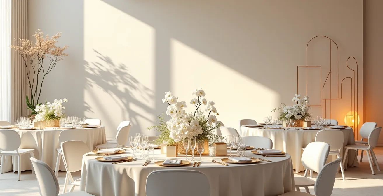
In modern design, what you don’t see is as important as what you do. Negative space—the “breathing room” around and between objects—is the silent cornerstone of a high-end aesthetic. It’s a principle that shifts the focus from filling a space to curating it. Instead of a dozen small, scattered centerpieces, imagine one striking, sculptural arrangement on a bare table. The empty space around it doesn’t feel void; it acts as a frame, commanding attention and amplifying the beauty of the object. This approach creates visual impact and a sense of calm sophistication, preventing the sensory overload that can make a space feel cluttered rather than celebratory.
This isn’t just an abstract theory; it’s a driving force in contemporary event design. In fact, negative space is identified as a key 2024 wedding trend for creating powerful moments, particularly in expansive venues like tents. The concept draws heavily from artistic traditions like the Japanese art of Ikebana, where the placement, lines, and empty space are as integral to the floral arrangement as the flowers themselves. By embracing this, you allow each chosen element to have its own moment and contribute to a larger, uncluttered narrative.
To implement this, focus on a few high-impact pieces rather than an abundance of small decorations. Think clean-lined furniture, simple linens, and minimalist signage. This creates a canvas where key details can truly shine. A single, dramatic floral installation or a sleek, well-designed photo backdrop will have far more emotional weight in a room with ample negative space. It’s a declaration of confidence in your design choices.
How to Mix Acrylic and Metal for a Sleek Industrial-Modern Vibe?
The marriage of acrylic and metal is a masterclass in intentional contrast. It’s where the ethereal meets the industrial, creating a look that is quintessentially modern yet layered with visual interest. Acrylic, with its transparent or “ghost” quality, is the ultimate tool for playing with negative space. Acrylic chairs, signs, or charger plates can define a space without visually cluttering it, allowing light and sightlines to pass through unobstructed. They add structure while maintaining a feeling of lightness and airiness.
In contrast, metal—whether it’s the warm glow of brushed copper, the sleekness of polished chrome, or the edginess of matte black—provides grounding and substance. Metal elements catch the light, add a touch of luxe, and introduce a solid, tangible quality that prevents the design from feeling too floaty or insubstantial. This juxtaposition is the key to avoiding a “cold” aesthetic. The transparency of acrylic is warmed by the reflective, rich tones of its metallic counterpart.
This textural interplay creates a sophisticated and dynamic tablescape. Imagine the scene below: the cool, clean surface of an acrylic charger plate is instantly warmed by the presence of brushed copper flatware. The light doesn’t just pass through the acrylic; it bounces off the metal, creating a subtle dance of reflection and refraction that adds depth and life to the setting.
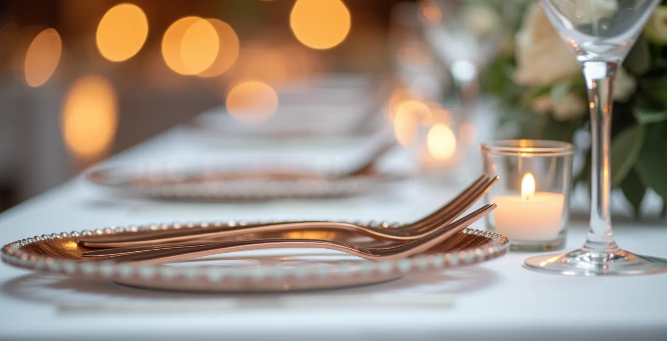
When curating this look, think about balance. Use acrylic for larger items to maintain an open feel and introduce metals in smaller, high-touch details like flatware, candle holders, or the legs of a table. This strategic mix ensures the design feels both sleek and industrial, but also layered, thoughtful, and far from one-dimensional. It’s a tactile experience that engages the senses beyond the visual.
Round Tables or Long Kings: Which Layout Defines a Modern Reception?
The choice between round and long tables is more than a logistical decision; it’s a foundational act of architectural storytelling that defines the entire energy of your reception. There is no single “correct” answer for a modern wedding. Instead, the question is: what atmosphere do you want to curate? Do you envision an evening of intimate, separate conversations, or a high-energy, communal feast? Your table layout is the primary tool to achieve that vision.
Round tables inherently create smaller, self-contained social pods. They encourage conversation among a group of 8-10 guests and allow for easy, organic circulation throughout the room. This can be ideal for groups with mixed dynamics, allowing guests to mingle comfortably within their immediate circle. In contrast, long King’s tables create powerful, linear sightlines and a strong architectural look. They foster a communal, banquet-style energy, unifying the room and making every guest feel part of a single, grand celebration. They are a statement in themselves, emphasizing structure and unity.
To help you decide which layout aligns with your modern aesthetic, consider this direct comparison of their inherent qualities. The data, sourced from event design experts, highlights how each choice impacts the guest experience.
| Aspect | Round Tables | Long King Tables |
|---|---|---|
| Social Dynamic | Intimate separate conversations | Communal high-energy banquet feel |
| Movement Flow | Meandering, organic circulation | Strong linear sightlines and defined aisles |
| Visual Impact | Creates separate conversation zones | Very modernist, architectural look |
| Best For | Mixed group dynamics | Creating unified atmosphere |
While long tables often read as more explicitly modernist, the key to warmth is in the styling. As noted by industry guides like The Knot’s analysis of minimalist decor, long banquet tables are the perfect canvas for adding textural warmth. A lush greenery runner, with or without florals, can soften the hard lines and introduce an organic element that runs the length of the room, connecting everyone in a beautiful, flowing design.
The “Trendy” Decor Element That Will Date Your Wedding Photos Instantly
The fear of your wedding photos looking dated in ten years is a valid one. It’s easy to point fingers at specific past trends—the chevron patterns of the early 2010s, the ubiquitous mason jars that followed. Today, you might worry about neon signs or an overabundance of pampas grass. But the truth is more nuanced. The element that truly dates a wedding isn’t the item itself, but the lack of personal context behind it. A trend used simply for the sake of being “on trend” becomes a generic timestamp of an era. A trend used to tell your story becomes timeless.
A neon sign with a generic phrase like “Happily Ever After” might feel dated in a few years. But a neon sign displaying a quirky inside joke between the two of you? That’s not a trend; it’s a piece of your personal history, rendered in light. The focus must shift from “what is in style?” to “what is our style?” This sentiment is echoed by industry experts who argue for authenticity over fleeting fads. As one Wedding Design Expert puts it in an analysis of timeless design:
It’s not a specific item (like neon signs or pampas grass) that dates photos, but the lack of personal context. A trend used without a story feels generic.
– Wedding Design Expert, Article Analysis on Timeless Wedding Design
So, how do you navigate current styles without falling into the trap of ephemeral trends? The key is a process of critical curation and personalization. Before incorporating any popular element, you must subject it to a simple test: does this resonate with our story, our history, or our shared values? If the answer is yes, then embrace it. If the answer is no, have the confidence to let it go, no matter how popular it is on Pinterest.
Action Plan: How to Avoid Dating Your Wedding Photos
- Apply the ‘Overexposure Rule’: Identify peak trends that are ubiquitous on Pinterest and Instagram. Be extra critical before using them.
- Tie Trends to Personal Narrative: As seen with the neon sign example, connecting a trend to your inside joke or shared memory makes it instantly timeless.
- Focus on Authenticity and Quality: Choose elements that have personal significance and invest in craftsmanship and genuine materials that age well.
- Prioritize Personal Significance: An element that is meaningful to you will always hold more value than one chosen purely for its visual appeal.
- Invest in Craftsmanship: According to Vogue’s insights on enduring style, genuine materials and quality construction have a permanence that outlasts trends.
How to Use Sans-Serif Typography to Anchor Your Modern Theme?
Typography is the unsung hero of your wedding’s design system. It is the visual voice of your celebration, appearing on everything from the save-the-dates to the menus and signage. For a modern aesthetic, clean, unadorned sans-serif fonts are the go-to choice. Their lack of decorative “feet” (serifs) gives them an inherent simplicity and structural clarity. Fonts like Helvetica, Futura, or Proxima Nova communicate a sense of effortless sophistication. But using them effectively—and warmly—goes beyond just picking a font from a dropdown menu.
The key to a sophisticated typographic system is creating a clear hierarchy using variations within a single font family. Instead of mixing multiple disparate fonts, explore the power of using different weights (light, regular, bold, black) and sizes of one cohesive font. A bold, oversized headline for your names on an invitation, paired with a light, smaller font for the details, creates a dynamic, artful composition. The font itself becomes a graphic element, a piece of minimalist art that communicates information with elegance and intention.
However, a common pitfall of minimalist typography is that it can feel cold or digital, especially when printed on standard paper. This is where textural warmth becomes crucial. Printing your beautifully clean typography on high-quality, textured paper stock—like thick cotton, handmade, or linen-finished paper—creates a powerful intentional contrast. The eye sees the clean, modern lines of the font, while the hand feels the soft, organic texture of the paper. This tactile experience adds a layer of warmth and luxury that stark white paper cannot. Similarly, consider using a warm off-black or a deep charcoal ink instead of a harsh 100% black to soften the overall look while maintaining a modern feel.
Why Dried Palms Are the Secret to Sculptural, Modern Floral Installations?
Modern floral design is evolving beyond soft, romantic bouquets. It’s becoming more architectural, more sculptural, and more about form than just color. In this new landscape, dried and preserved florals have emerged as a key medium, with wedding industry statistics showing that dried florals and neutral tones are a defining aesthetic of the year. And at the forefront of this movement are dried palms. With their dramatic fans, sharp lines, and inherent rigidity, dried palm fronds act less like flowers and more like building blocks for art installations.
The power of dried palms lies in their sculptural quality. Unlike fresh flowers, which are soft and ephemeral, dried palms hold their shape, allowing for the creation of bold, geometric, and asymmetrical arrangements that feel permanent and intentional. They can be used to create a breathtaking ceremony backdrop, frame an entrance, or add height and drama to a reception space. Their neutral, earthy tones—ranging from bleached white to natural tan—fit perfectly within a modern color palette, providing texture and form without overwhelming the space with color.
The magic happens when these structural elements are used to play with light and shadow. As seen in the installation below, strategic uplighting can turn a collection of dried palms into a dynamic art piece. The strong shadows they cast against a clean white wall become an integral part of the design, adding depth, movement, and a touch of drama. This is modernism at its best: using simple forms to create complex and engaging visual effects.
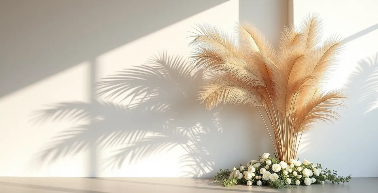
To add a layer of warmth and contrast, these rigid sculptural forms can be paired with small, curated clusters of soft, fresh flowers like white roses or orchids at the base. This juxtaposition of the permanent and the ephemeral, the rigid and the soft, creates a stunningly beautiful and deeply modern floral statement. It’s a move away from traditional arrangements and toward a more considered, artistic expression of your style.
The Durability Truth About Matte Black Flatware Renters Won’t Tell You
Matte black flatware is the epitome of modern, edgy chic. It offers a dramatic departure from traditional silver or gold and makes an immediate, bold statement on any tablescape. However, its popularity has led to a flood of options on the rental market, and a whispered fear among couples and planners: its supposed lack of durability. The “truth” that rental companies won’t explicitly advertise is not that all black flatware is bad, but that quality is the only thing that matters.
Low-quality black flatware is often made with a thin PVD (Physical Vapor Deposition) coating over cheap stainless steel. This is where the problems arise. With rough handling or improper washing, this coating can easily scratch, chip, or flake off, revealing the silver metal underneath. This results in a look that is not chic and modern, but worn and cheap—precisely the opposite of the high-end aesthetic you’re trying to achieve. It reinforces the fear of a modern design choice looking cold and poorly executed.
In contrast, high-end rental companies invest in heavy-duty, superior-quality flatware. As noted by professional suppliers, their collections are often crafted for durability with a finish that resists fingerprints and is designed to withstand commercial cleaning. For instance, guides on professional black flatware rentals emphasize that their pieces have the right weight and balance, feeling substantial and luxurious in the hand. These companies have rigorous maintenance, cleaning, and sanitizing processes to ensure every set delivered is in pristine condition. They absorb the risk and cost of maintaining a high-quality inventory.
So, the secret isn’t to avoid matte black flatware. It’s to be diligent in your choice of rental partner. Ask direct questions: How is the flatware manufactured? What is your process for cleaning and inspecting for damage? Can you provide a sample? Choosing a reputable vendor who prides themselves on the quality of their inventory ensures your tables will have the sleek, sophisticated, and flawlessly modern look you envisioned.
Key takeaways
- True modern luxury comes from using negative space to create focus and give emotional weight to your curated decor.
- Any trend, from neon signs to pampas grass, can be made timeless by grounding it in your personal story and context.
- The “Mod-Boho” 80/20 rule—80% clean modern structure, 20% curated bohemian warmth—is the perfect formula for a chic yet inviting aesthetic.
Modern vs. Bohemian: How to Merge Opposing Styles into “Mod-Boho”?
For the couple who loves clean lines but also craves a free-spirited, warm, and personal feel, the “Mod-Boho” aesthetic is the perfect synthesis. It’s the ultimate expression of intentional contrast, proving that a modern wedding can be rich with personality and warmth. This style isn’t a chaotic mix of two opposing ideas; it’s a curated fusion that takes the best from both worlds. It pairs the clean lines and structural elements of modern design with the rich textures, earthy tones, and whimsical charm of bohemian style.
The philosophy is to build a modern foundation and then layer it with carefully selected bohemian accents. Think of it as creating a minimalist art gallery and then filling it with unique, soulful, and handcrafted pieces. The result is a space that feels both sophisticated and effortlessly cool, structured and relaxed. It’s about maintaining the free-spirited essence of boho while containing it within a contemporary, organized framework. This prevents the “anything goes” clutter of pure bohemianism and elevates it to a more refined, editorial level.
A simple yet highly effective way to approach this is the “80/20 Rule” of Mod-Boho design. This principle provides a clear and actionable framework for achieving the perfect balance:
- Design the space with 80% clean, modern fundamentals. This includes minimalist furniture (like sleek dining chairs and tables), a neutral color palette, and clear, uncluttered layouts. This is your canvas.
- Add 20% curated, high-impact bohemian elements. This is where the personality comes in. Think vintage rugs to define a lounge area, unique pottery for centerpieces, textured throws over a modern sofa, or macrame details hung within a structured geometric frame.
This rule ensures that the overall feel remains modern and sophisticated, while the bohemian touches add the crucial layers of warmth, texture, and individuality. A geometric metal arch (modern) adorned with wild, asymmetrical florals (bohemian) is a perfect example. By consciously blending these opposing styles, you create a design narrative that is uniquely yours, resolving the tension between the chic and the comfortable.
By moving beyond generic minimalism and embracing a philosophy of intentional contrast, you can craft a modern wedding that is anything but cold. It will be a curated, layered, and deeply personal reflection of your story—a celebration that feels as warm and inviting as it is undeniably chic. Begin curating your modern wedding narrative today by focusing on the intentional contrasts that tell your unique story.