Wedding design lives and dies in the details. While sweeping floral installations and dramatic lighting capture attention, it’s the thoughtful accessories—the hand-tied bouquet ribbons, the weight of an invitation, the legibility of an escort card—that transform a beautiful event into a cohesive, memorable experience. These elements work quietly but powerfully, guiding guests, reinforcing your aesthetic, and revealing the level of care invested in every decision.
For couples and planners alike, accessories and details represent both opportunity and challenge. They offer countless ways to express personality and creativity, yet they also demand careful consideration of logistics, budget, and longevity. Understanding how these components function—both independently and as part of a larger design narrative—is essential for creating weddings that feel intentional rather than assembled. This article explores the core categories of wedding accessories, from bridal party florals to dance floor surfaces, revealing the technical and aesthetic decisions that separate thoughtful design from mere decoration.
Bridal bouquets and personal flowers for the wedding party serve a dual purpose: they’re both a designed accessory and a practical item that must survive hours of handling, photography, and environmental exposure. The decisions made in their construction directly impact both their visual appeal and their durability.
The natural, organic look that suggests flowers were freshly gathered from a garden has become a design staple, but achieving this effect requires deliberate technique. Unlike tightly structured arrangements, this style relies on intentional asymmetry and varied stem heights to create visual movement. Florists often incorporate unexpected elements—unripe berries, seed pods, or foliage in varying stages of maturity—to reinforce the “found” quality.
The choice between uniformity and mix-and-match approaches for bridesmaids extends beyond the bouquets themselves. Some designers create subtle variations using a consistent color palette but different focal flowers, while others maintain identical compositions for visual rhythm in processional photographs. Neither approach is inherently superior; the decision should reflect whether the overall wedding design emphasizes curated harmony or organic diversity.
The mechanics of bouquet construction often go unnoticed but significantly affect both appearance and longevity. Ribbon selection involves more than color coordination—the weight, texture, and trailing length of ribbon create visual balance and can dramatically alter the bouquet’s proportions. Silk ribbons photograph differently than velvet; long trailing ribbons create vertical lines in images but can tangle during wear.
Stem wrapping techniques serve both aesthetic and practical functions. They conceal mechanics, protect hands from thorns, and provide structural integrity. Equally important but frequently overlooked: hydration logistics. Bouquets constructed hours before a ceremony require water sources, yet the transition from water tubes to final presentation must happen at precisely the right moment to maximize freshness without risking visible mechanics in photographs.
Budget-conscious couples should know that personal flowers often offer the highest cost-to-impact ratio in floral design. A bride carries her bouquet in nearly every photograph, making it worthy of investment, while ceremony aisle markers—visible for minutes—may warrant simpler treatment.
Wedding stationery establishes aesthetic expectations before guests ever arrive at your venue. The invitation suite functions as a tangible preview, communicating formality level, color palette, and design sensibility through tactile and visual cues that digital communications simply cannot replicate.
Understanding luxury printing methods requires evaluating their cost-to-impact ratio honestly. Letterpress creates a tactile impression that guests physically feel, signaling substantial investment and attention to detail. However, this technique works best on soft, thick papers—typically 220 lb cover weight or higher—which directly affects postage costs. A single-ounce difference can push invitations into a higher postage tier, multiplying costs across your entire guest list.
Blind debossing offers subtle elegance through texture rather than color, creating dimensional interest without ink. This technique excels for monograms or border details but can be lost on heavily textured papers. The effectiveness depends entirely on lighting conditions when guests open the envelope—a consideration often overlooked during selection.
One-color printing typically costs significantly less than two-color work, but the jump from two to three colors is often marginal. This pricing structure creates opportunities for strategic design decisions. Adding a second color exclusively for accent elements—perhaps just the couple’s names or a botanical illustration—can create visual hierarchy without the expense of full multi-color printing.
Metallic elements in stationery walk a fine line between sophisticated and ostentatious. The key lies in selective highlighting rather than comprehensive coverage. Hot foil stamping produces a raised, reflective surface with sharp detail, while digital foil printing offers more affordable application but can lack the dimensional quality of traditional methods.
Choosing the right metallic requires considering your paper’s texture and color. Gold foils read as warm and traditional; rose gold feels contemporary; silver and platinum appear crisp and modern. However, metallics on heavily textured papers can appear broken or incomplete—what printers call the “scratch test.” Running your fingernail across the foil reveals whether it’s adhered smoothly or sitting atop the paper’s peaks, which affects both appearance and durability through postal handling.
A cohesive stationery suite extends beyond matching fonts and colors. The sequence of elements creates a deliberate unboxing experience: envelope liner patterns that echo venue details, RSVP card strategies that simplify guest response while maintaining design integrity, and assembly decisions that affect both presentation and mailing logistics.
Hand-lettering versus digital fonts represents more than aesthetic preference—it signals formality level and personal investment. Custom calligraphy suggests bespoke attention, while carefully selected typefaces can achieve elegance with greater consistency and easier implementation for multi-piece suites. Map illustrations offer genuine utility for destination weddings or venues with complex access, justifying their cost through reduced guest confusion and late arrivals.
The transition from cocktail hour to dinner represents a critical logistical moment where thoughtful details prevent confusion and crowding. How guests locate their seats, read signage, and navigate the space directly impacts their comfort and your timeline.
The debate between alphabetical and table-number organization isn’t merely stylistic—it affects guest flow patterns. Alphabetical arrangements spread guests across the entire display, preventing bottlenecks, while table-number groupings can create congestion if multiple guests need the same section. For outdoor settings, windproofing strategies become essential: weighted bases, acrylic protective covers, or alternative display methods that secure cards against elements.
Dual-purpose favors that also serve as escort cards solve two design challenges simultaneously, but they require careful execution. The favor must be substantial enough to feel gift-like yet practical enough that guests can easily transport it to their table. Edible items work particularly well for this application, though personalization must remain legible—a common pitfall when decorative elements overwhelm functional text.
Planning for missing guests—those who RSVP’d yes but don’t attend—prevents awkward gaps in your display. A slightly oversized arrangement with intentional spacing allows discrete removal of cards without obvious holes. Legibility for senior guests often gets overlooked in favor of artistic fonts, yet a significant portion of most guest lists requires clear, high-contrast text to read escort cards in dim reception lighting.
Acrylic and mirror signage create stunning contemporary aesthetics, but they present technical challenges in reflection management and readability. Acrylic thickness directly correlates with bowing resistance—thin acrylic warps when displayed vertically, distorting text. Material under 1/8 inch thickness requires frame support, while 1/4 inch or thicker can stand alone with appropriate backing.
Vinyl adhesion on mirrors depends on surface preparation and climate conditions. Humidity affects adhesive cure time; cold temperatures prevent proper bonding. Backing painting techniques—applying paint or leafing to the reverse side of clear acrylic—create dimensional, shadow-free letters, but this process requires professional execution to avoid visible brushstrokes or uneven coverage.
The choice between easels and frames affects both stability and post-event repurposing potential. Easels offer flexibility in placement but can tip on uneven surfaces. Frames provide finished presentation and easier transportation but add weight and cost. Consider whether signage elements have post-wedding utility—personalized dates and names limit repurposing, while generic welcome signs or bar menus can transition to home décor.
The traditional wedding favor has evolved from obligatory tchotchke to optional meaningful gesture. Modern couples increasingly question whether small gifts enhance guest experience or simply create waste, leading to more intentional approaches.
The edible versus keepsake debate hinges on consumption versus retention. Edible favors—artisanal chocolates, local honey, specialty coffee—get consumed and enjoyed without adding to household clutter. Keepsakes require genuine utility or aesthetic appeal to justify their existence; most guests don’t need another picture frame or candle in a custom scent they didn’t choose.
Welcome boxes for destination weddings or hotel room drop-offs serve a distinct purpose: they provide immediate utility and local orientation. Thoughtful curation might include:
The donation alternative—contributing to a meaningful cause in lieu of physical favors—appeals to values-driven couples but requires clear communication. Simple signage at each place setting explaining the contribution prevents guests from wondering if favors were forgotten. This approach eliminates presentation logistics, storage, and transportation while potentially offering tax benefits and supporting causes aligned with the couple’s values.
Certain accessories function as infrastructure, shaping how guests interact with space. Dance floors and display systems fall into this category—substantial investments that dramatically affect both aesthetics and function.
Customizing dance floors with monograms, graphics, or patterns creates a reception focal point that anchors the room design. However, surface requirements matter: printed vinyl wraps require smooth subflooring to prevent bubbling and premature wear. The white versus patterned floor debate involves more than appearance—patterned surfaces camouflage scuffs and wear throughout the evening, while pristine white floors photograph beautifully initially but show every mark.
Design longevity during the event deserves consideration. High-traffic areas near bars or buffets deteriorate faster; strategic pattern placement can disguise this wear. Safety and slip resistance must never be sacrificed for aesthetics—glossy surfaces that photograph well can become hazardous when wet or on uneven ground.
The removal cost surprise catches many couples off-guard: dance floor rental quotes often exclude breakdown, transportation, and cleaning fees. These “hidden” costs can add 20-30% to the apparent rental price. Request comprehensive quotes that include all phases of service, and confirm timeline expectations—some vendors charge premium rates for late-night removal.
Whether your wedding incorporates dramatic structural installations or focuses on subtle finishing touches, these accessories deserve the same strategic thinking applied to major design elements. Each detail represents a decision point where beauty, budget, logistics, and guest experience intersect. By understanding the technical considerations and aesthetic implications behind these choices, you create not just a decorated event, but a thoughtfully designed experience where every element serves a purpose and contributes to a cohesive whole. The magic of wedding accessories lies in their ability to communicate care, create comfort, and craft memories—often in ways guests feel more than consciously observe.
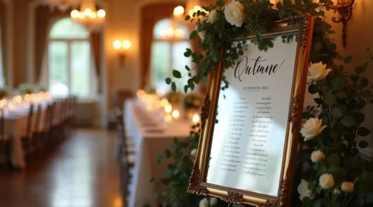
The elegance of a mirror sign is irrelevant if specular reflection and material failure make it impossible for guests to read. True legibility is an engineering outcome based on material science—using 1/4-inch acrylic to prevent bowing and proper surface preparation…
Read more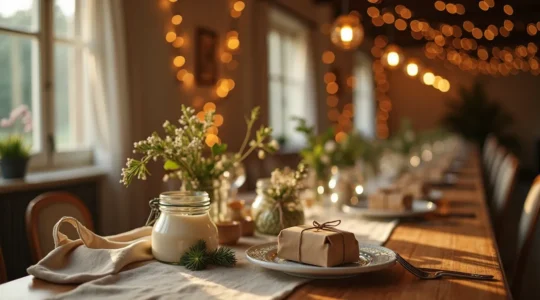
The most successful wedding favors are not branded mementos for you, but practical acts of service for your guests. Personalized trinkets with initials or dates are the most likely to be discarded, creating unnecessary waste and expense. Gifts that solve…
Read more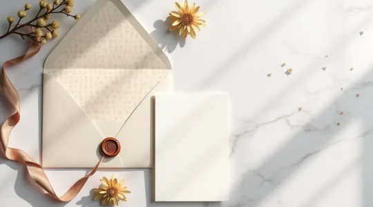
Your wedding invitation isn’t just a mailer; it’s the most critical branding document for your event, designing the guest experience long before the day itself. Every element, from the texture of the paper to the RSVP method, is a strategic…
Read more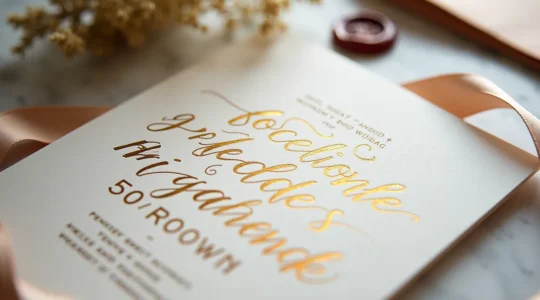
The fear that gold foil will make your invitations unreadable is valid, but the solution isn’t to use less foil—it’s to use foil smarter by strategically controlling how it interacts with light, paper, and color. True luxury comes from hot…
Read more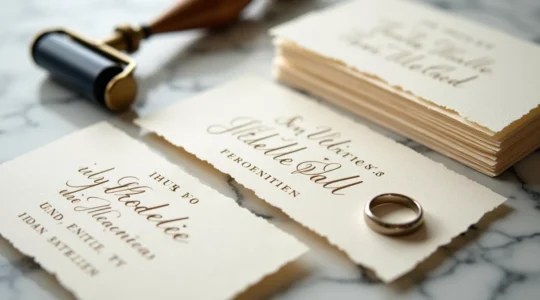
The 40% premium for letterpress is not a cost; it’s an investment in a verifiable sensory experience that digital printing cannot replicate. Value is tactile: A deep, luxurious impression is only achievable on heavy paper, making 600gsm cotton stock a…
Read more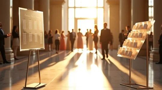
The fastest method to seat 150 guests is not an aesthetic choice; it’s a solved logistical problem where reducing guest search time is the primary variable. A decentralized, alphabetical escort card system minimizes guest cognitive load and creates a robust,…
Read more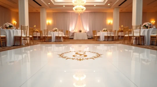
A stunning custom dance floor is a technical success, not just a design choice; its perfection hinges on surface integrity, material science, and contract diligence. Surface preparation is non-negotiable; an uneven, dirty, or recently waxed floor guarantees adhesion failure and…
Read more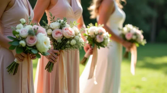
The key to an effortlessly chic bridal party isn’t matching dresses, it’s the artfully imperfect hand-tied posy. Texture and movement from elements like silk ribbons are more important than perfect color matching. Strategic choices—like exposed stems or varied bouquets—create a…
Read more